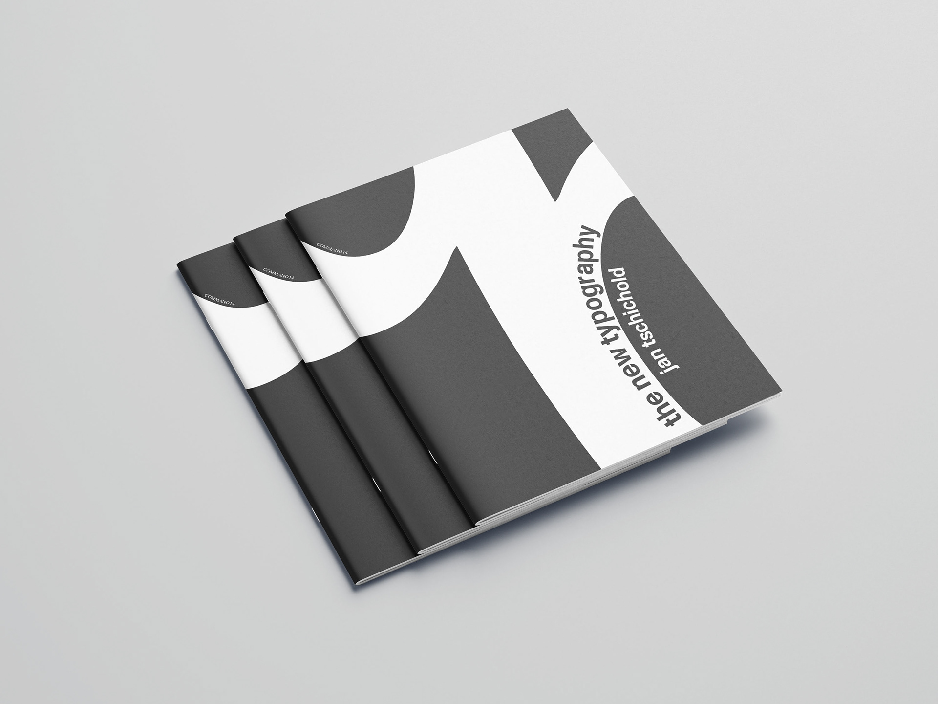
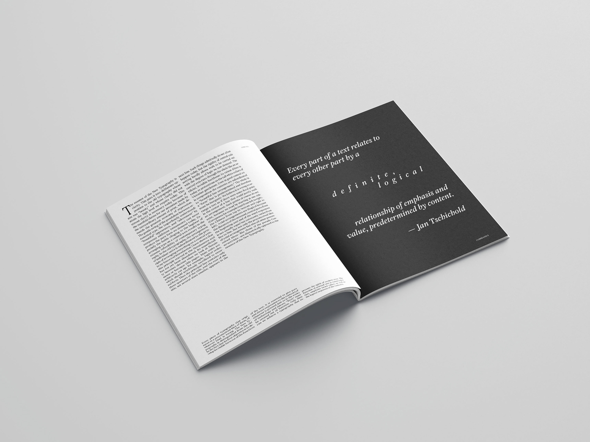
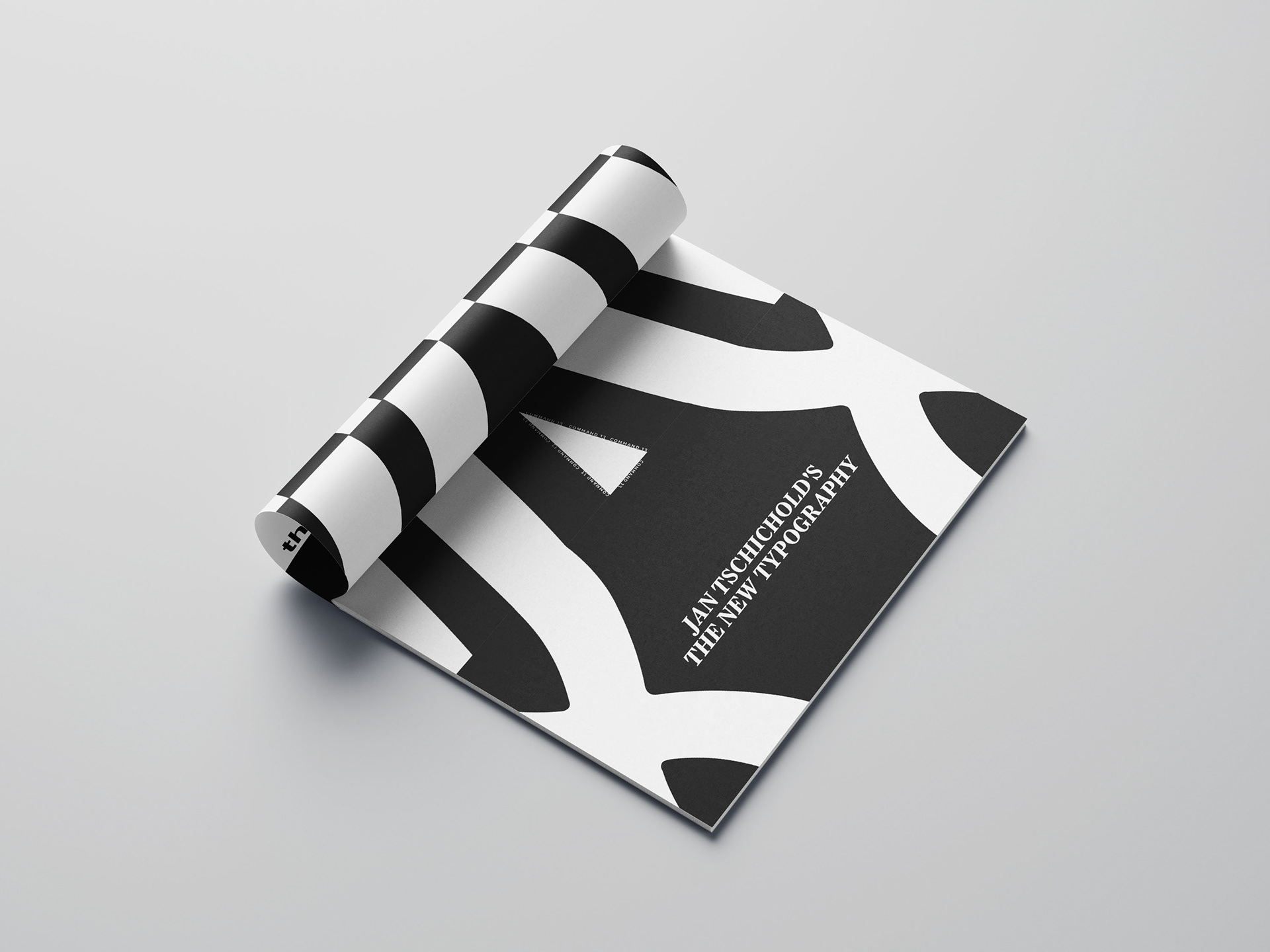
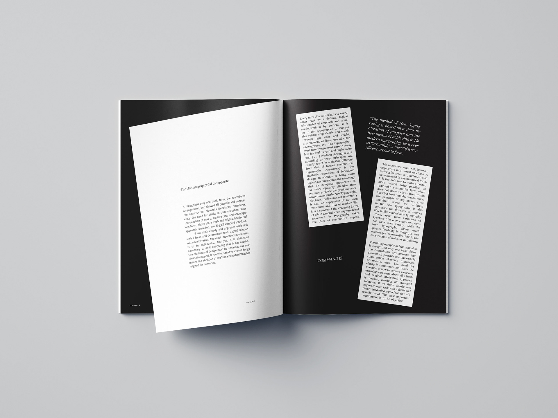
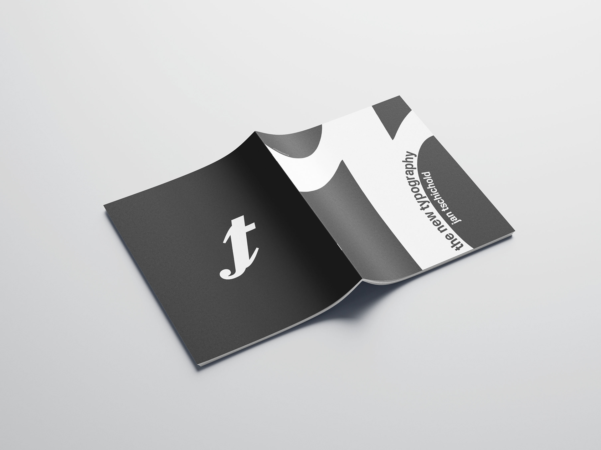
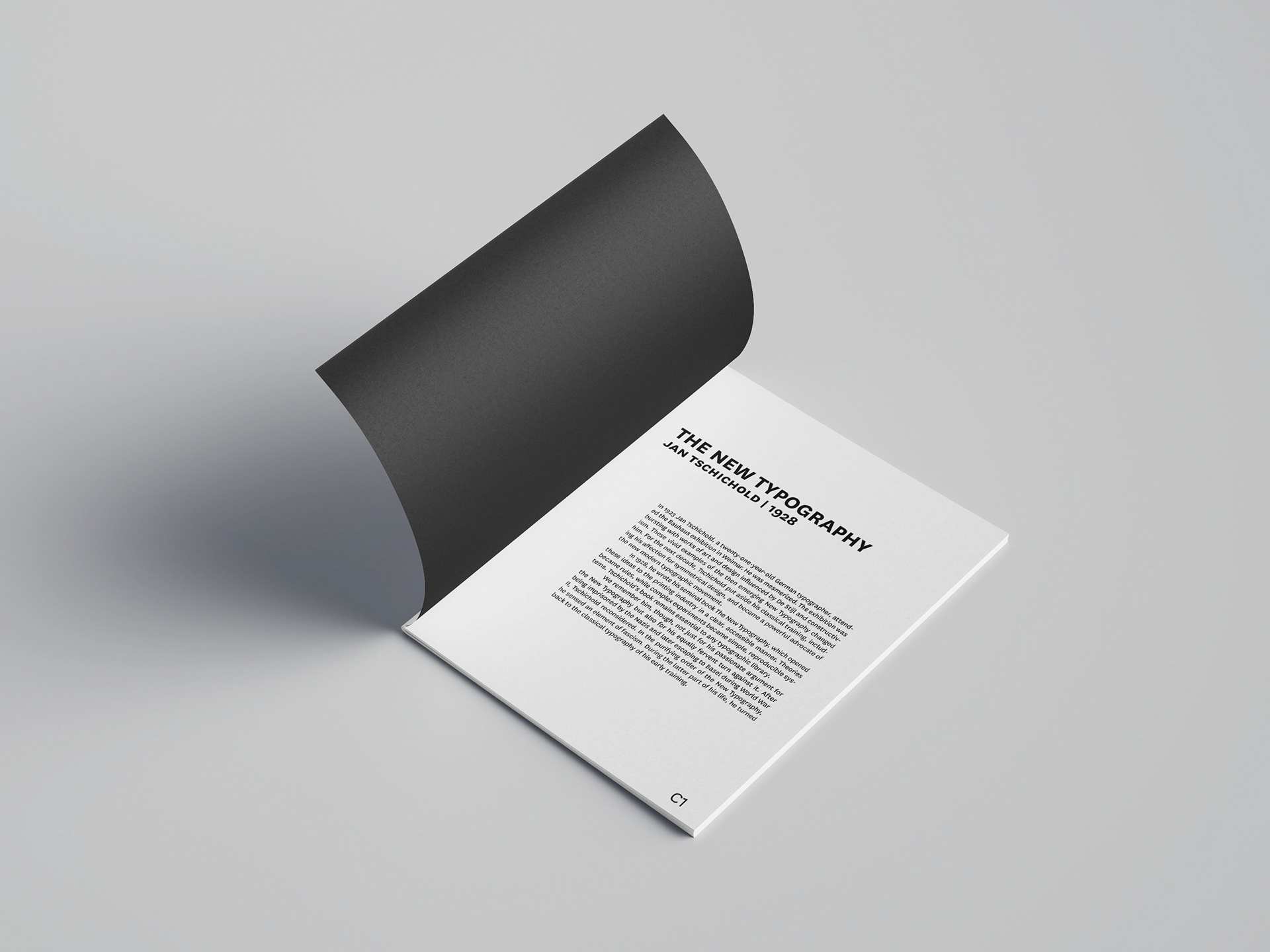
Command #14: Design the cover of your publication. Use just the headline.

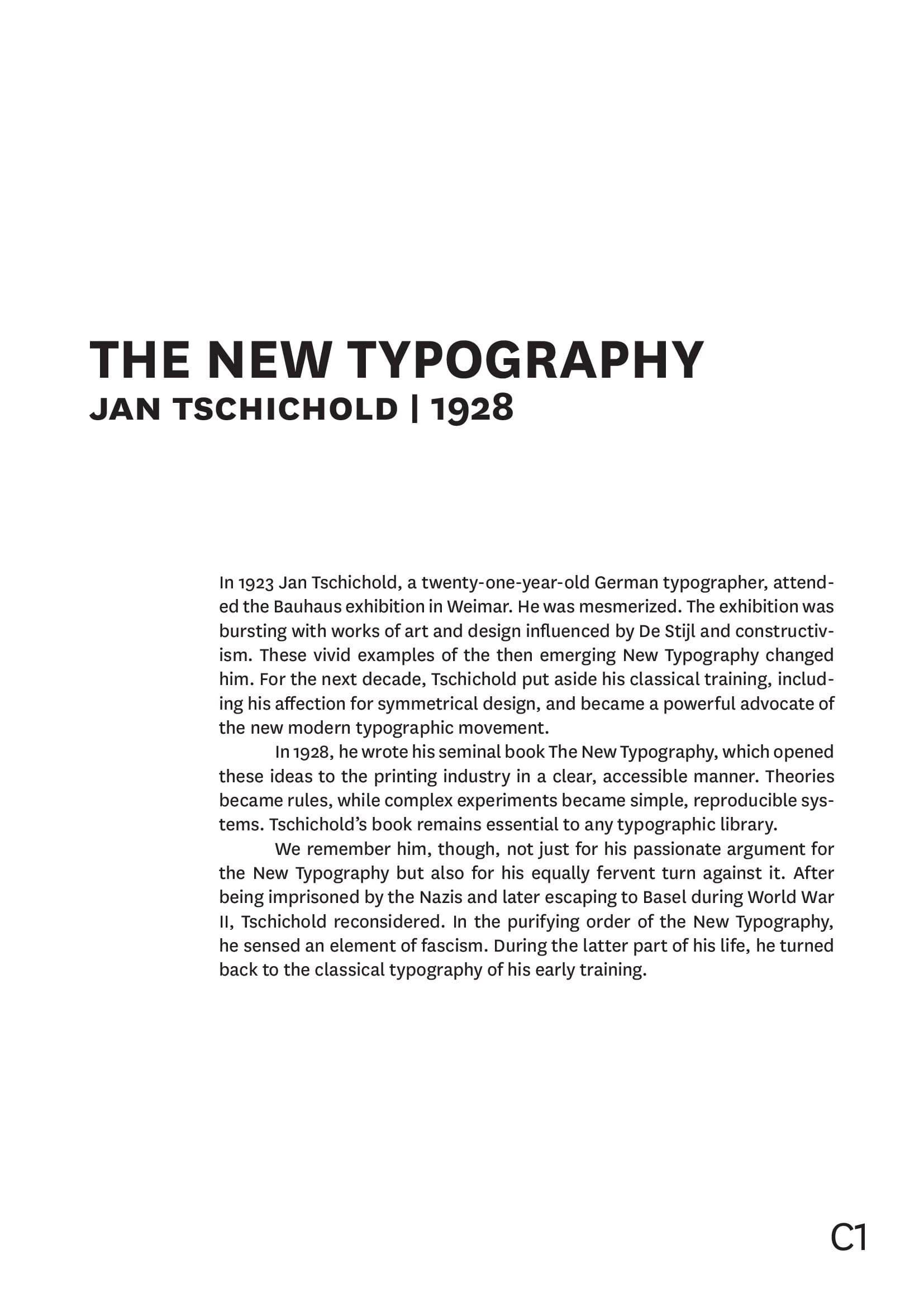
R: Command #1: Structure the text, order by sense units. Define a type area beforehand.Define the heading and subheadline and set the text in a font of your choice in a single-column, left-justified flutter set. Try different font sizes and pay attention to the distance between the lines (LEADING). Pay attention to a good rhythm of rag.
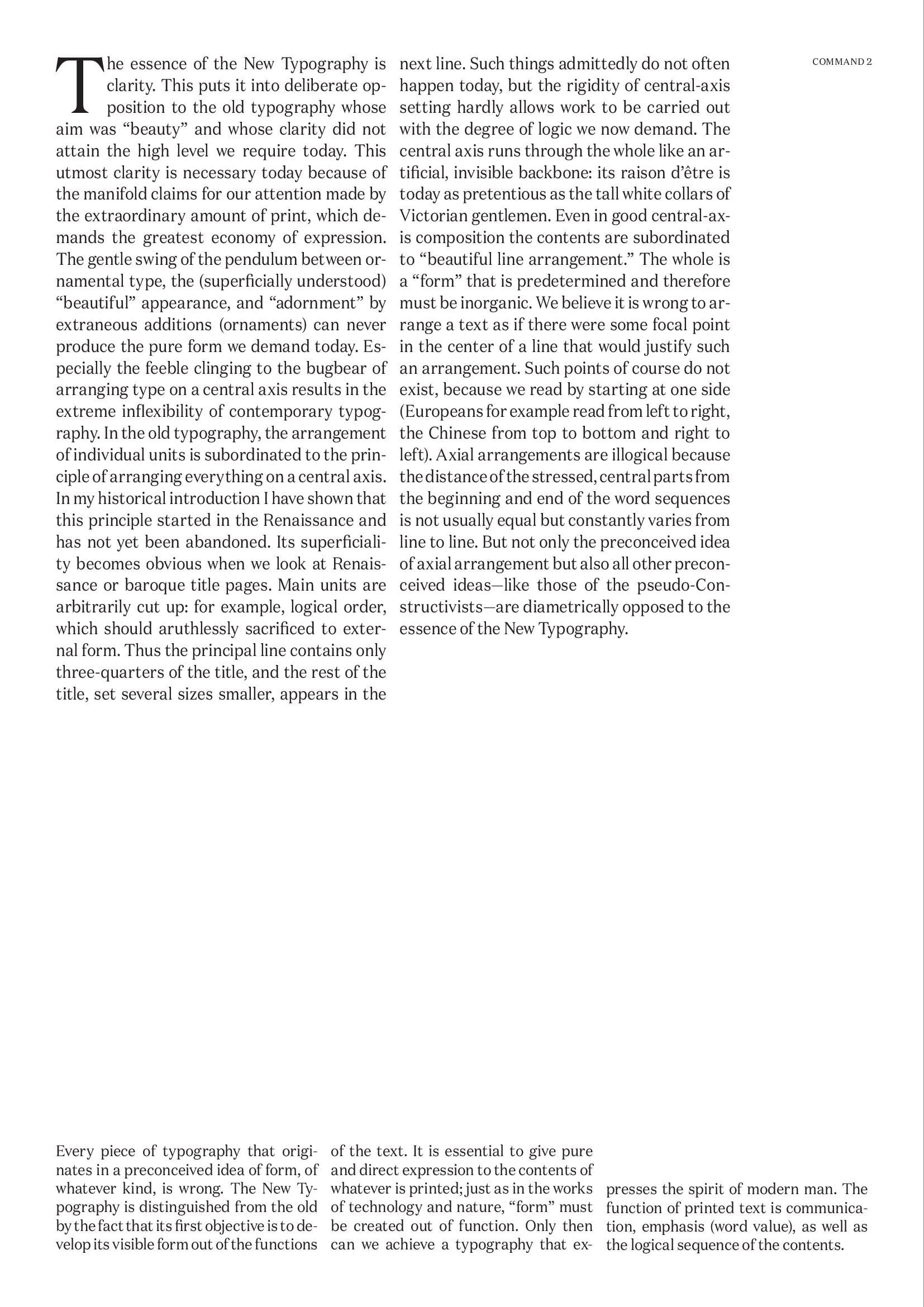
L: Command #2: Set the text in two columns and three columns.
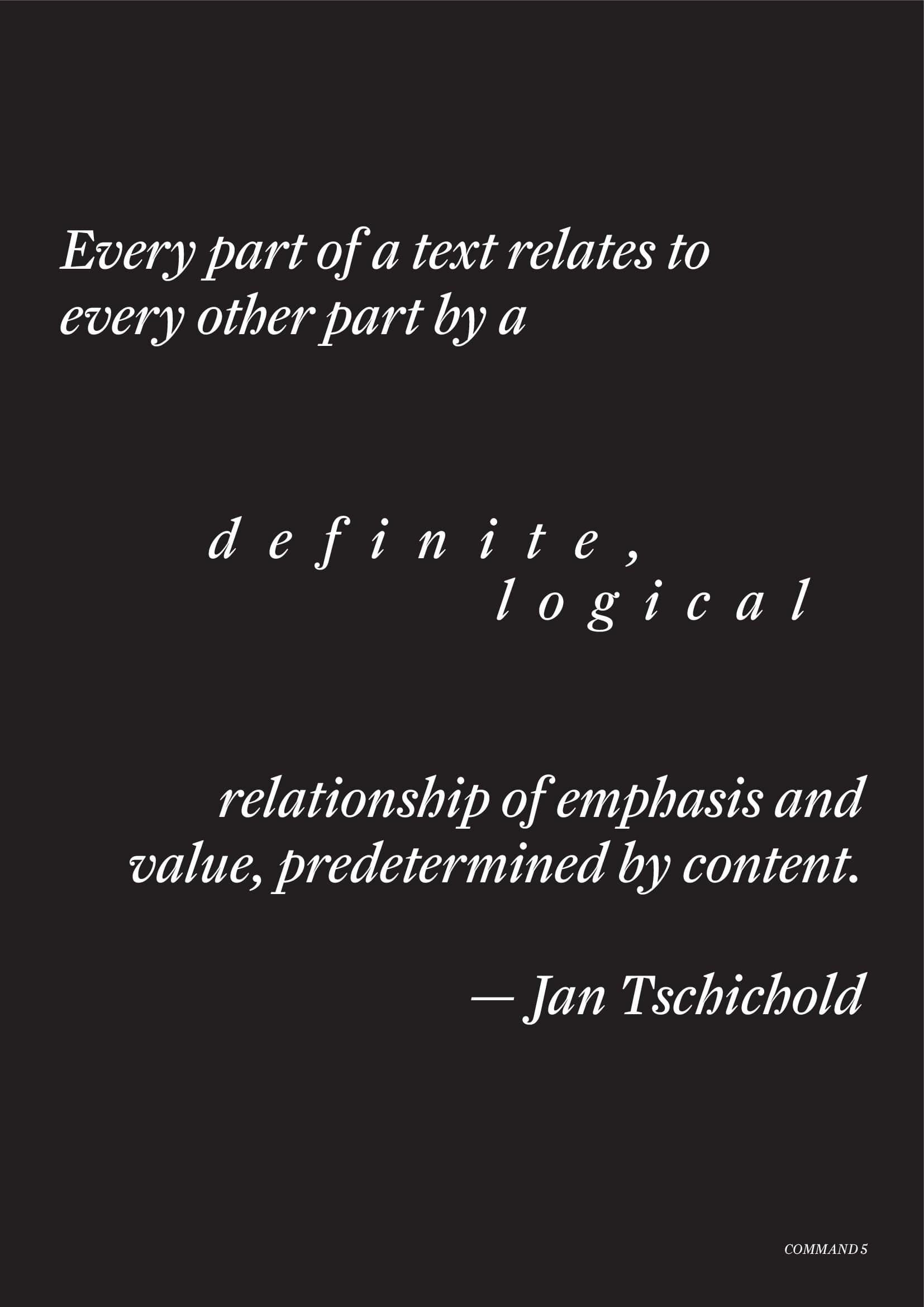
R: Command #5: Highlight important words or names by increasing the Tracking. (The choice of words should make sense) 36pt.
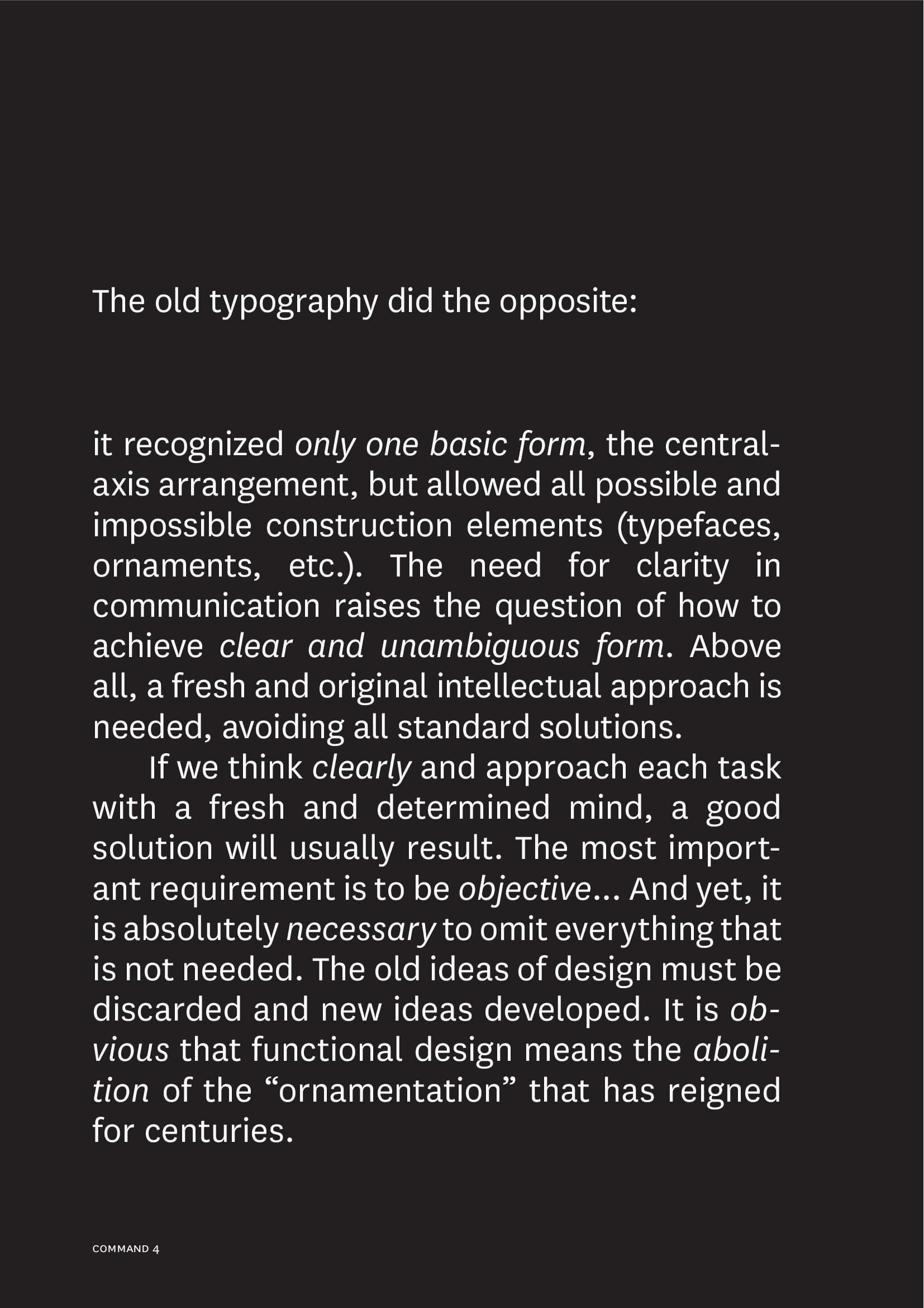
L: Command #4: Highlight important words or sense units in the text Italic. (The choice of words should make sense.) 24pt.
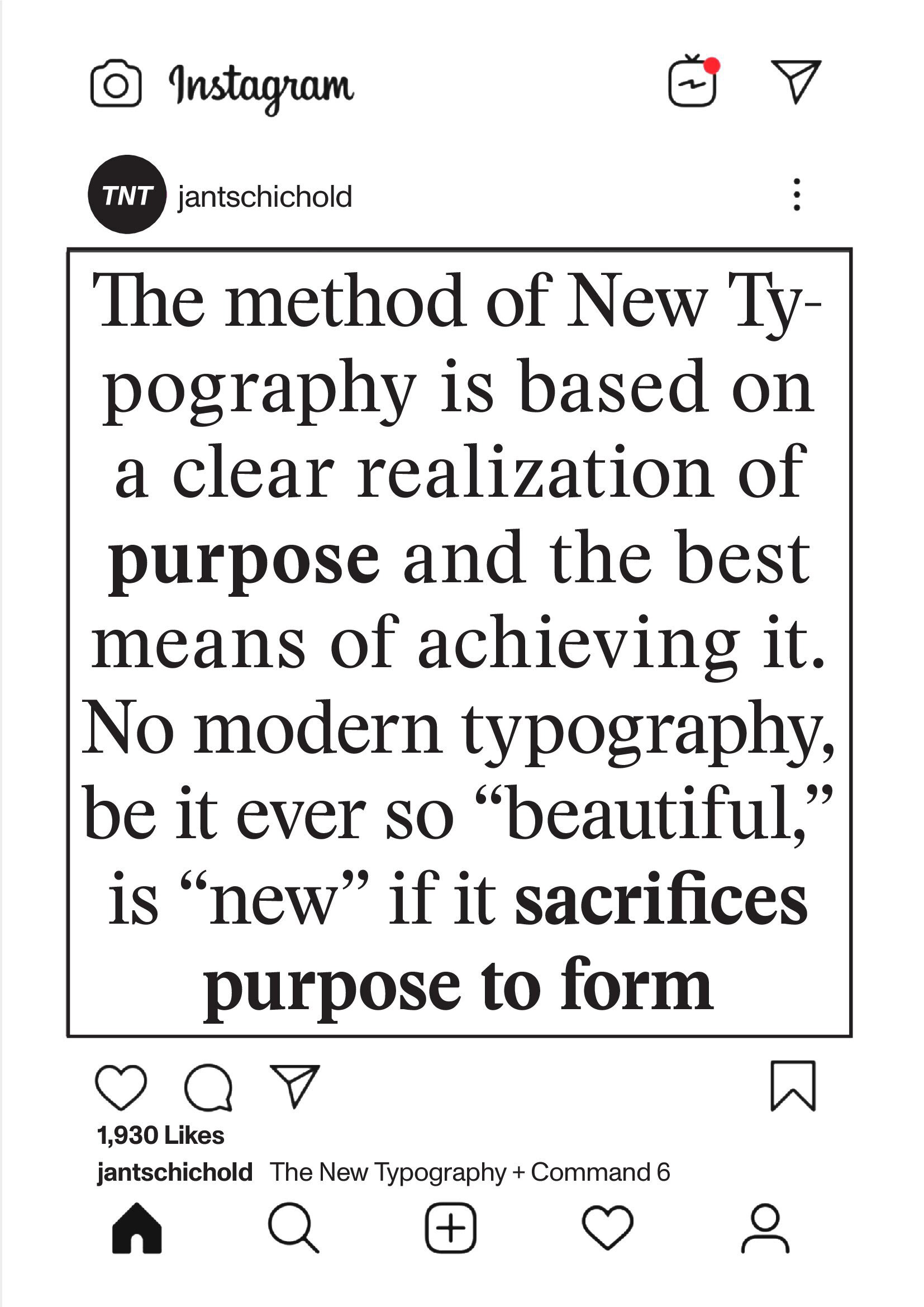
R: Command #6: Highlight single words in the text bold. (The choice of words should make sense) 48pt.
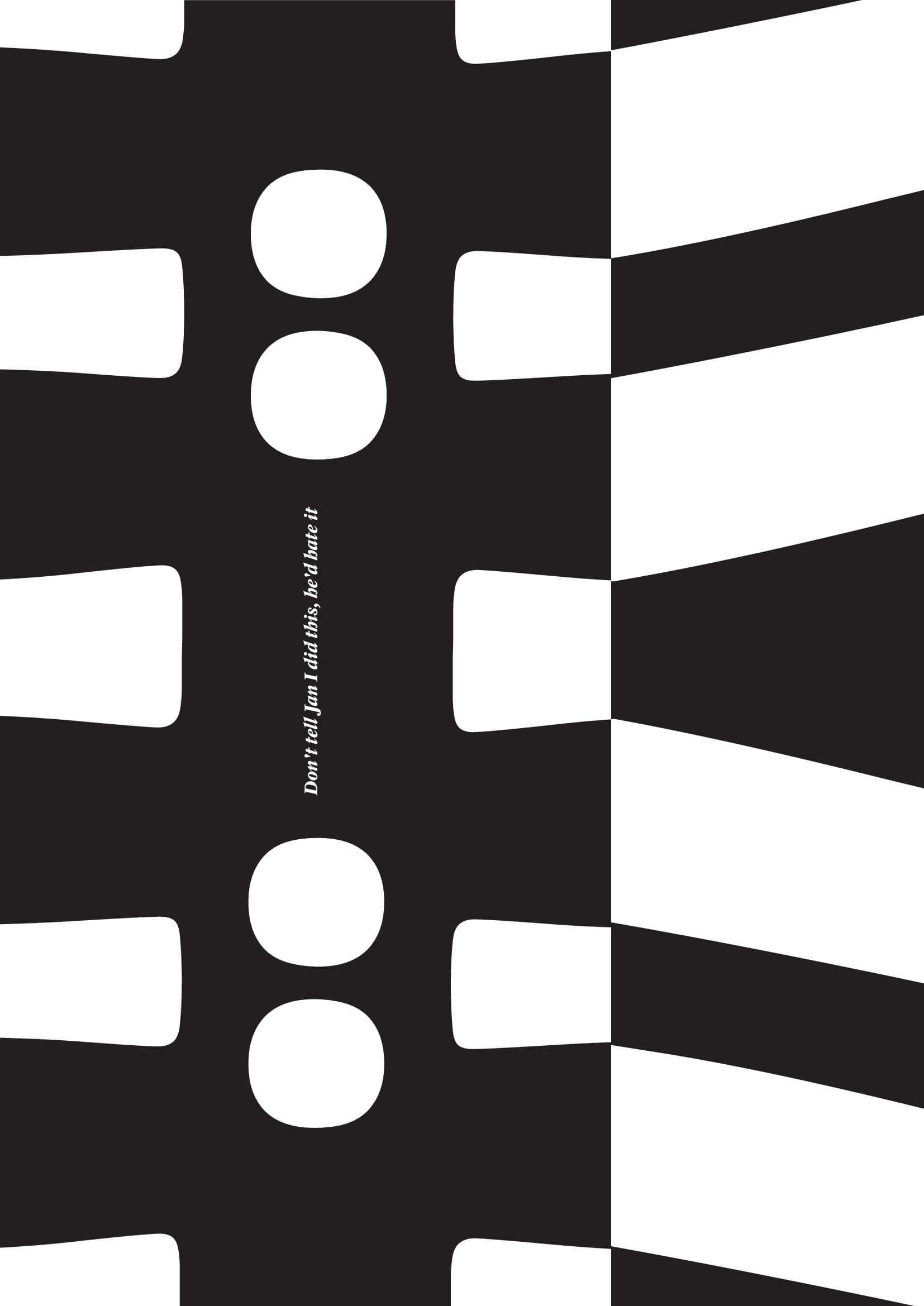

Poster in the middle of the publication. Command #13: Design the text as a poster in Format DIN A4. Put the headline of the text in the main focusof your design. The reading text can be spread over the whole format. Pay attention to the readability of the text and the sense of the dis- tribution of the text blocks. The text should still be readable.
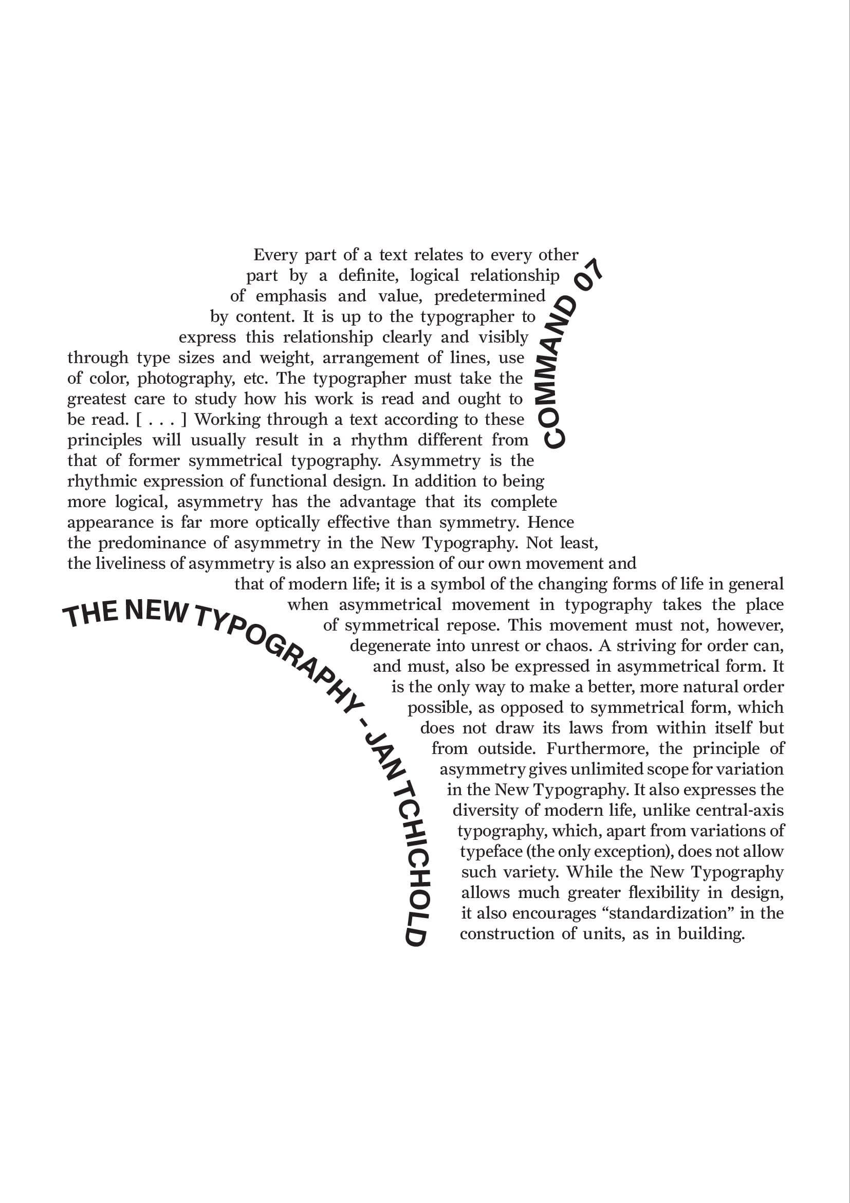
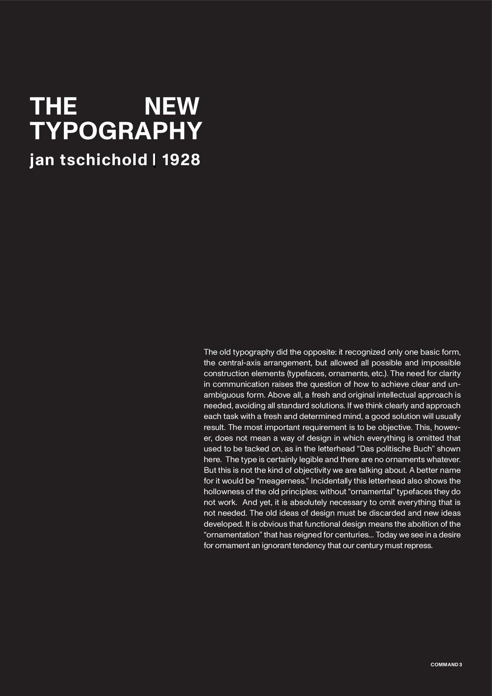
L: Command #7: Place your text within a self-selected geometric shape.
R: Command #3: Set the text in 3 different font sizes. (10pt, 20pt, 30pt).
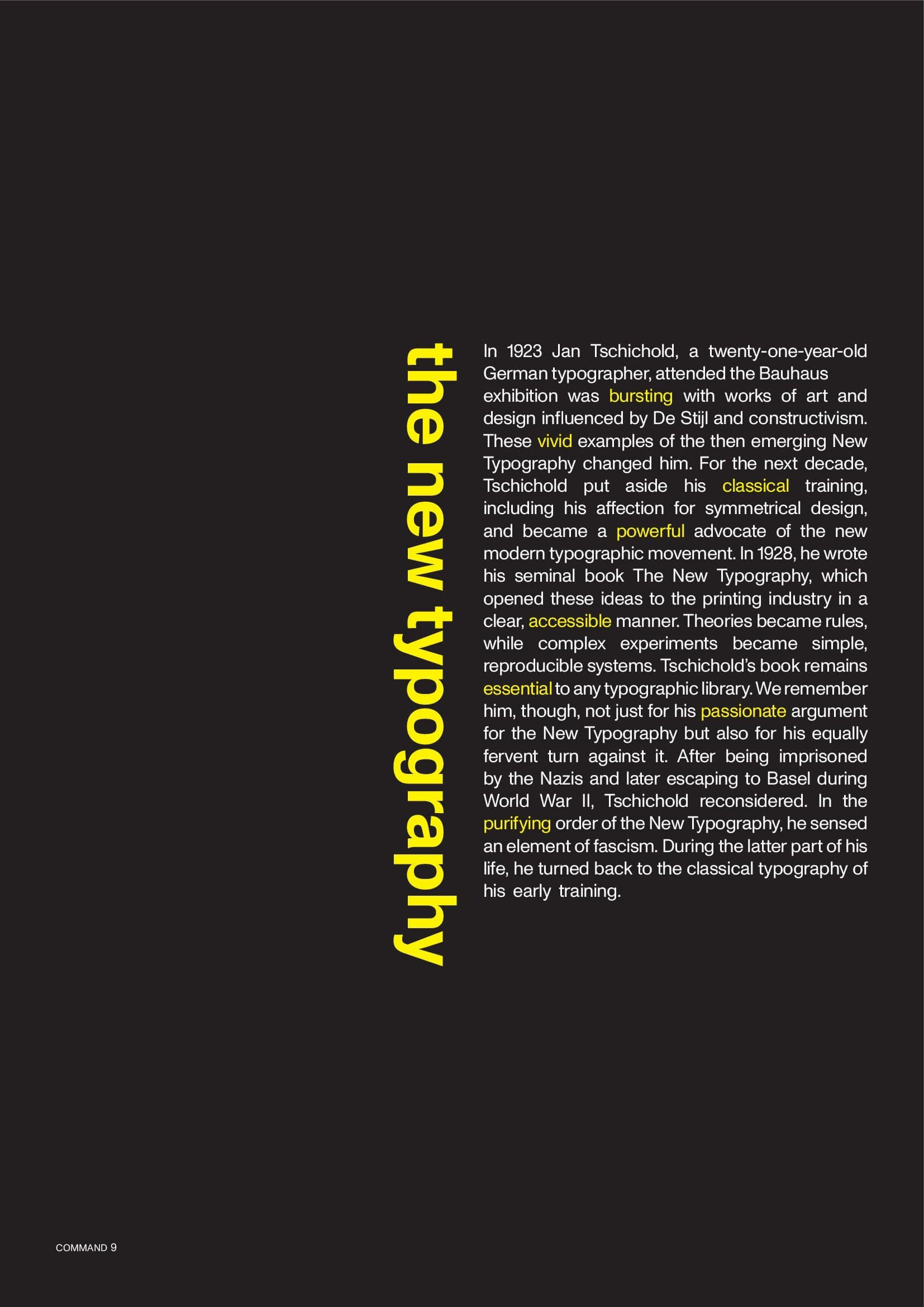
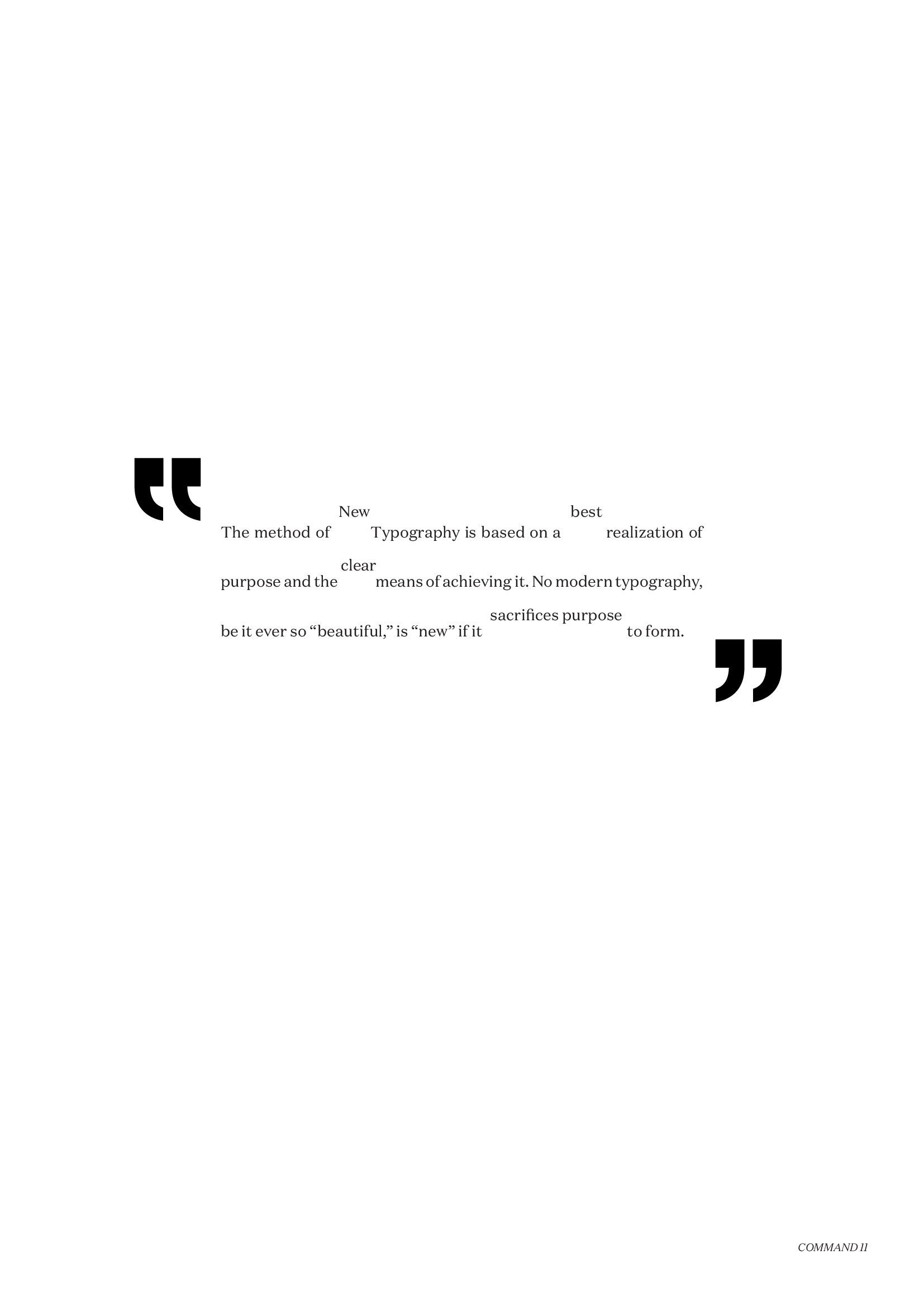
L: Command #9: Add a second color as a markup color.
R: Command #11: Set your text "clear" structured. 10pt
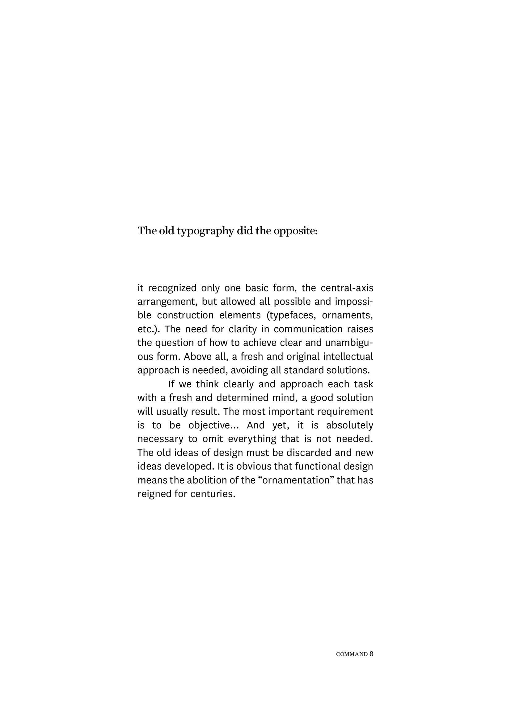
L: Command #8: Highlight passages by using 2 different fonts. Try to find an optically balanced use for the two different fonts. Think about your font and point size choice carefully.
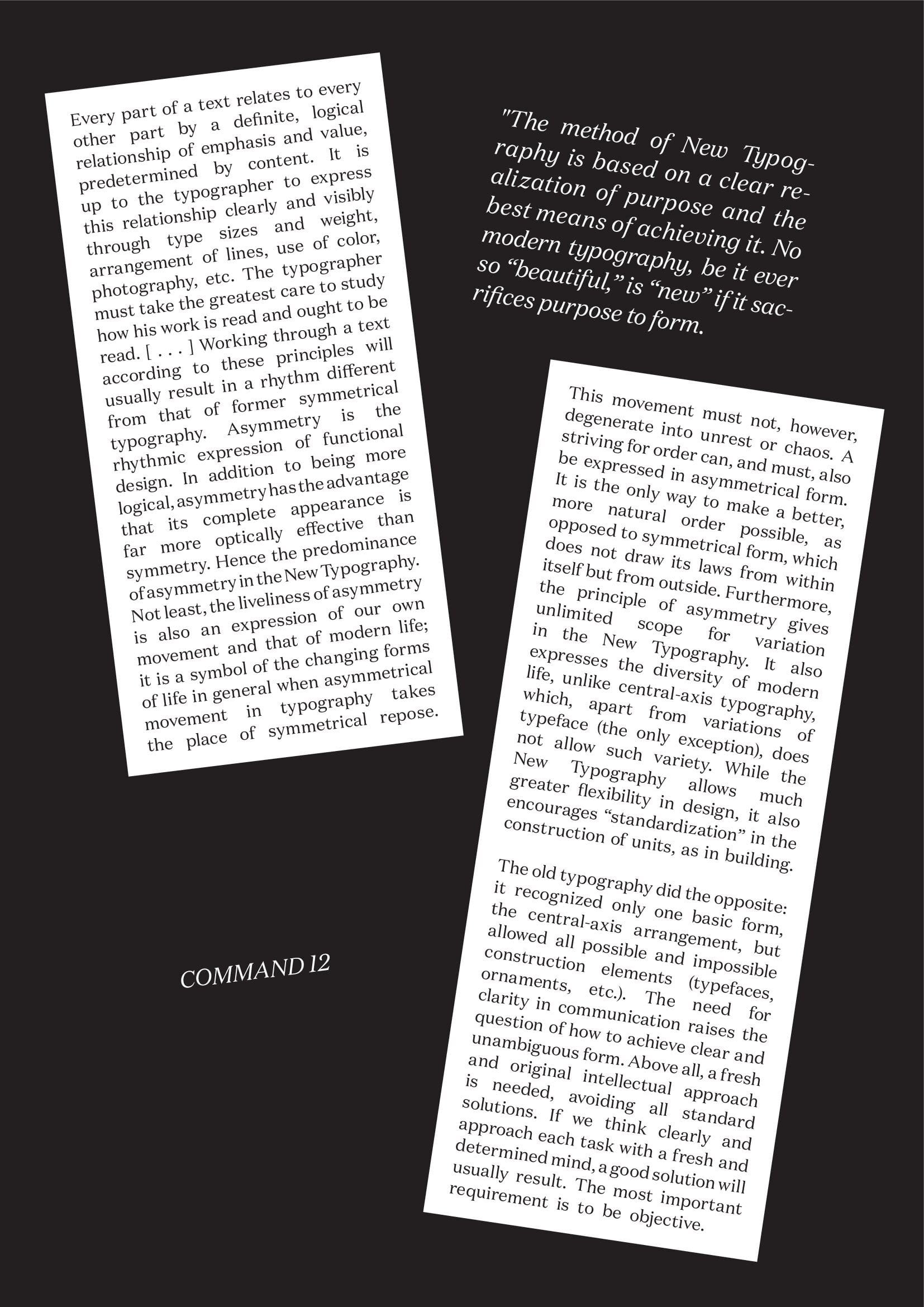
R: Command #12: Set your text „chaotic“ in different font sizes.
Command #10: Set your text "playful". Textsize 18pt
